Segals Outdoor Furniture
The Project
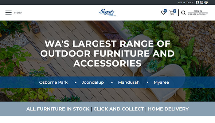
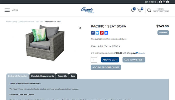
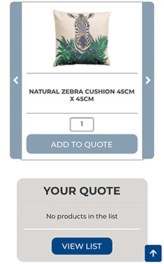
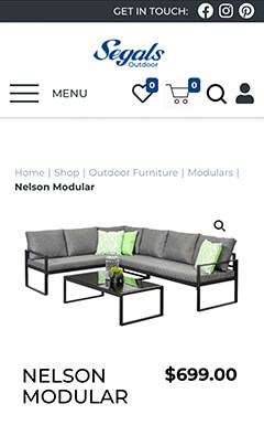
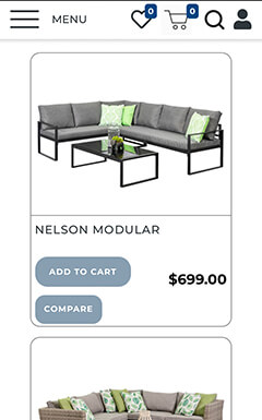
Creating a modern, responsive e-commerce site that highlights their unique Mix & Match feature and more clearly guides site visitors through the purchasing process.

 #004683R:0 G:70 B:131C:100% M:47% Y:0% K:49%
The Brand
Their logo and iconic shade of blue were the only branding elements we were asked to carry over to the newly designed site, giving us relatively free reign to create a new look for the site.
Wireframes
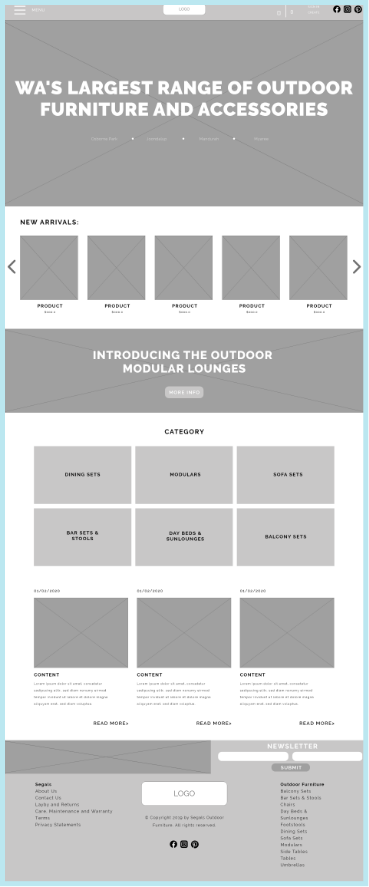
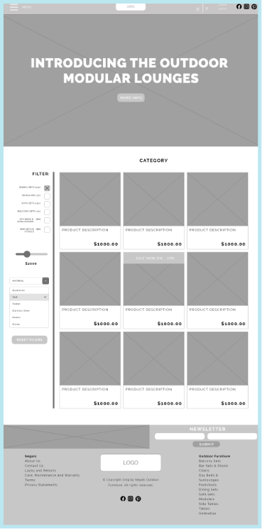
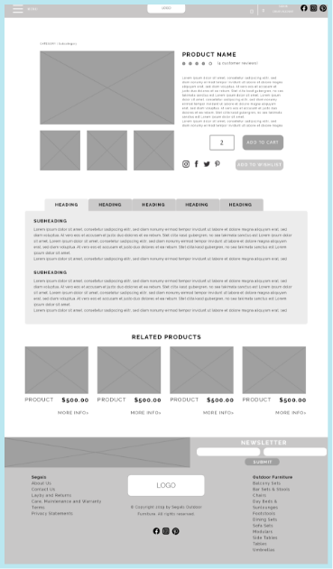
Planning is crucial for any project. By doing extensive research and working closely with the client we were able to create a new site layout.


UX
We introduced several elements into the site to improve the user experience:

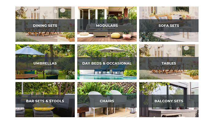
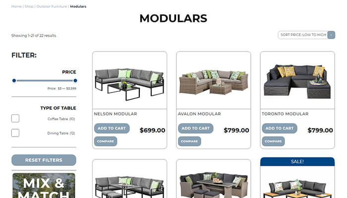
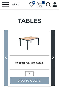
Each product category has it’s own specific filter, allowing customers to find exactly what they are looking for as quickly as possible.

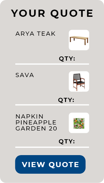
The search functionality of the site has been completely updated. We took great care ensuring the search bar instantly began linking queries to products ensuring easy navigation for customers.

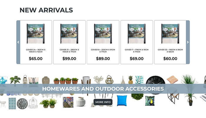
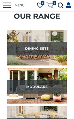
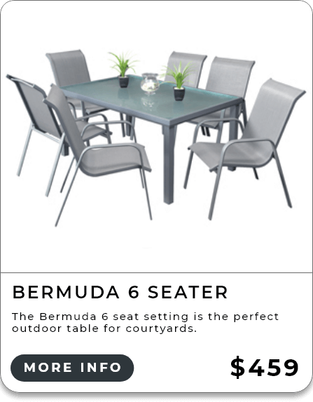
The entire layout of the site was redesigned from the ground up to ensure the most pertinent information was shown to site visitors, getting them to the products they are looking for even faster.

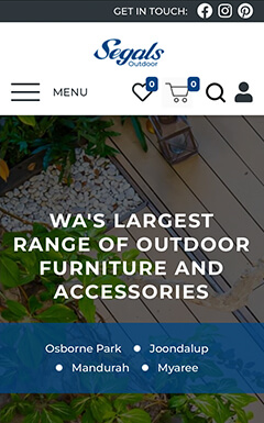
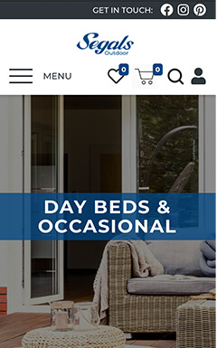
Being fully responsive is absolutely necessary in today’s marketplace. Through rigorous testing we ensured every element transitioned smoothly between desktop and mobile version of the site.
The Finished Product

UI Elements
Colour:
#004683
R: 0, G: 70, B: 131
C: 100%, M: 47%, Y: 0%, K: 49%
#889FB1
R: 136, G: 159, B: 177
C: 23%, M: 10%, Y: 0%, K: 31%
#FFFFFFR: 255, G: 255, B: 255C: 0%, M: 0%, Y: 0%, K: 0%
#2E363BR: 46, G: 54, B: 59C: 22%, M: 8%, Y: 0%, K: 77%
#DBD8D5R: 219, G: 216, B: 213C: 0%, M: 1%, Y: 3%, K: 14%
Typefaces
ABCDEFGHIJKLMNOPQRSTUVWXYZabcdefghijklmnopqrstuvwxyz1234567890.,?!@#$%^
ABCDEFGHIJKLMNOPQRSTUVWXYZabcdefghijklmnopqrstuvwxyz1234567890.,?!@#$%^
ABCDEFGHIJKLMNOPQRSTUVWXYZabcdefghijklmnopqrstuvwxyz1234567890.,?!@#$%^
Credits

Cale
Web Developer

Isaac
UX/UI Designer

