Case Study

Change is the lifeblood of our industry.
From humble beginnings...


We’ve had challenges and struggles. Late nights and tight deadlines. Too much coffee and not enough sleep.
We’ve continued to grow...
But all of that experience; working on new and unique projects, sharing our collective knowledge, in turn growing our team...
Into what we are today.

Has helped us evolve into something we’re pretty proud of.
We want to ensure we’re accessible to everyone.
We’ve done extensive testing to ensure our website passes WCAG 2.0 A and AA contrast tests for optimum readability.
Every inch of our website is accessible, with screen readers being able to read every piece of content and image on our site.
We believe that collaboration means everyone gets a seat at the table and we wanted our website to reflect that.
We want you to explore our business your way.
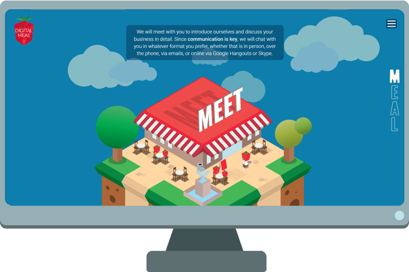
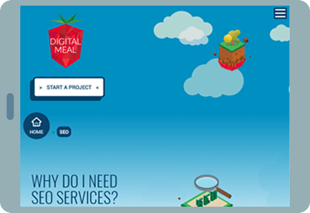

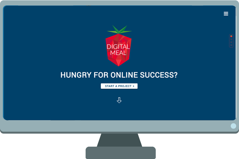
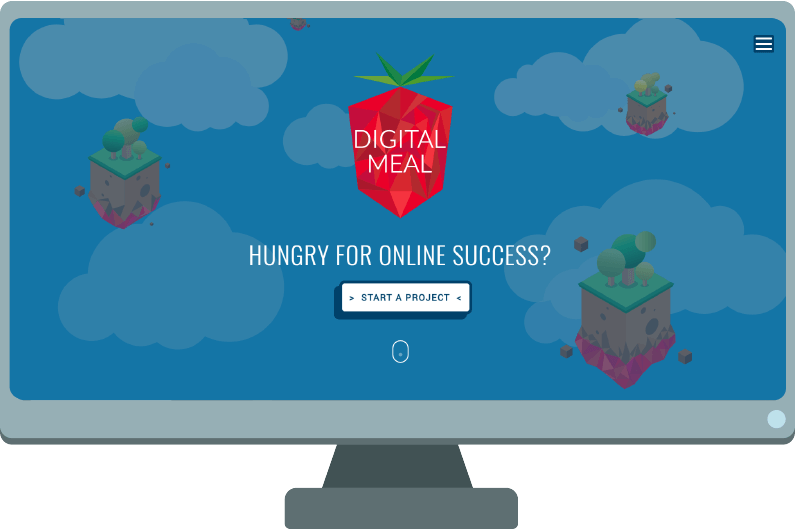
It doesn’t matter what device you’re using, we’ve optimised our site to be responsive on all devices, including mobiles and tablets. Explore our business the way you want to.
We wanted our branding to better reflect what we’ve grown into.
By looking at our existing branding we took feedback from the public to critically analyse what worked... and what didn’t.
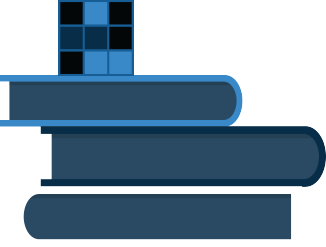
Our Logo

The tessellation of our logo represents our team coming together, working harmoniously to achieve a goal. The vector style we chose reflects our shared love for video games.
Our Typefaces
ROBOTO is our main typeface. We use it for it's readability and flexability.
OSWALD is our secondary typeface. It has great character and is fun without being too crazy.
Why fix something that isn’t broken? By utilising the flexibility of our existing typefaces, Roboto and Oswald, we’ve adopted a friendly yet professionally accessible look.
Our Colours
CMYK: 100-78-34-107
RGB: 15-66-107
HEX: 0F426B
Another aspect we’ve retained from our existing branding is our signature blue. By adding a secondary hue, we believe we’ve achieved a lighter feel that compliments our tone of voice and creates a more personable atmosphere.
Our Visual Tone
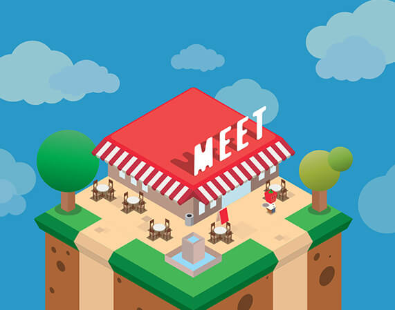
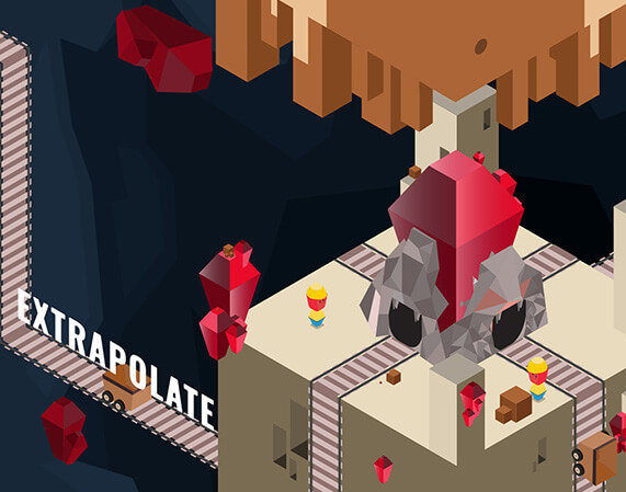
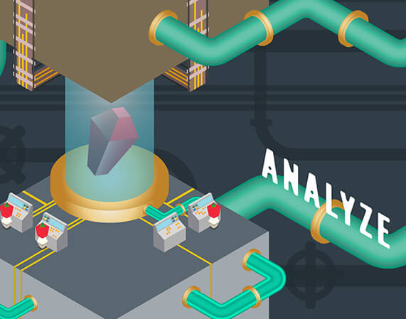
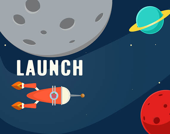
We don’t believe that working with a digital agency has to be a cold and impersonal affair. We want to create an enjoyable experience for our clients, to enjoy our work as much as we do! We wanted to create a visual tone that was suitable for a digital medium, but also providing a sense of familiarity.


